
From Familiar to Fresh- A Story of Companies and Their Evolving Logos
Home / Business / From Familiar to Fresh- A Story of Companies and Their Evolving Logos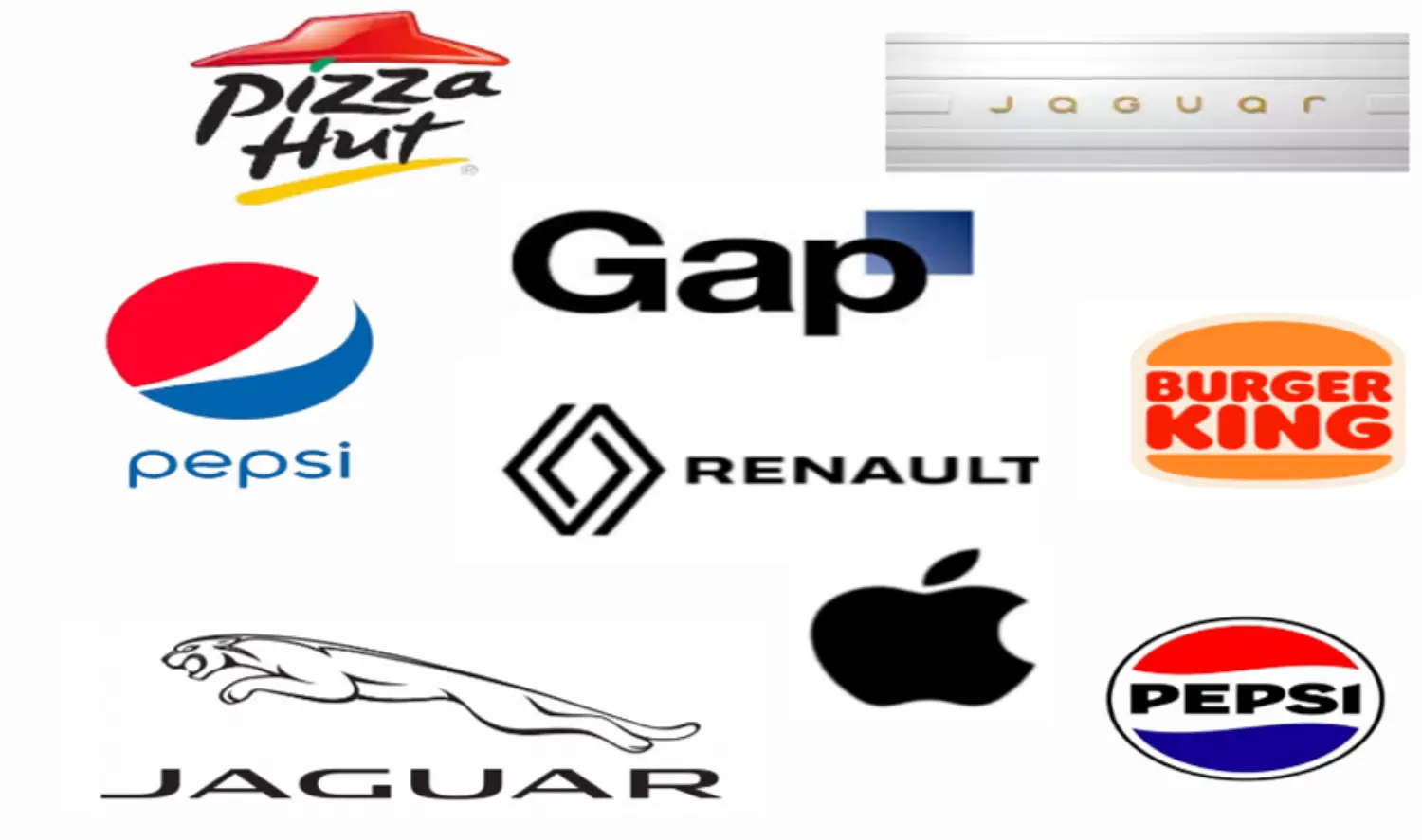

Shruti Mishra
In today’s ever-changing business landscape, a logo is not just an image—it’s a representation of a company’s identity and values. As the preferences evolve, brands constantly urge to stay relevant by tweaking their logos. These changes also highlight the growth and a shift in the right direction. These logo redesigns mirror the changing dynamics of branding and the importance of staying visually connected with audiences.
A logo is often the first impression a brand makes on the customer. In the current trend, the logos have become flatter, minimalist versions of their elaborate self to suit the digital form. One recent example is Jaguar in 2024. Jaguar speaks of this change as the beginning of a new era. This reimagined brand tries to fit in with the current scenarios and takes a step to stay relevant. This step has invited mixed responses from the public, expressing nostalgia for the old, detailed logo with more character.
The market is crowded with various choices and standing away from the crowd becomes very imperative for the brands and it is a crucial decision for them to make. Pepsi’s 2023 logo redesign was a bold move. It signified their return to a retro-inspired look, incorporating elements from its old- 1990s design, while also keeping the futuristic swirl. The brand continuously adapts to what its audiences love and find appealing.
However, not all changes succeed; some might misfire, alienating the loyal customers. The most infamous misfire is Gap’s attempt to modernize its logo. They faced a serious backlash from its audience, so much so, that they returned to their old logo in just six days. Another such incident was noticed with Pizza Hut, where they added swirl-like elements to enhance and modernize their logo in 2014. However, they brought back their old elements, sticking to their nostalgic factor. A logo remains a crucial tool in defining how a brand communicates with the world.
While change is necessary, keeping logos relevant requires creativity and a deep understanding of the customer’s perception of your brand. Not all changes are appreciated, and not all changes are met with applause. After all, a good logo not only represents the brand but also resonates with its customers.
Related Blogs

Stock Market at New Heights In 2023: Trends and Future Prospects
Sarthak Rastogi A boy who loves to read and write, is passionate for…

Nostalgia In Marketing: Just a trend or something more?
Shrijal As an introverted soul with a deep love for literature, I find…

The Rise of Fintech
Arisha Ali Rahi A girl who loves writing, whether it be fiction or not….

AI’s Role in Marketing: Is AI a friend or foe for consumers
Khushi Jain A person with a delightful blend of shyness and spontaneity. Despite her…

Nexus Between International trade and economic growth in India
Sarthak Rastogi A boy who loves to read and write, is passionate for fitness and…

Golden Threads: India’s Timeless Love for Gold
Satyam The author is someone who has a profound passion for staying updated on…