
The Power of Less: Why International Brands Adopt Minimalist Elements
Home / Business / The Power of Less: Why International Brands Adopt Minimalist Elements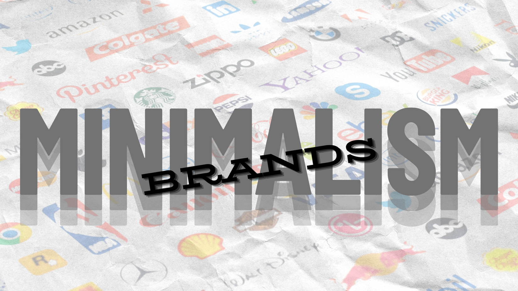

Aman Madaan
PGDM- Marketing
Look around yourself. Don’t many of today’s logos seem to have all been designed in the same place? We are losing the ultra-chaotic symbols, complex drawings, and gold-leaf gradients of our childhood. They are replaced by simple shapes, flat sans-serif fonts, and an extremely limited palette of crayons. Although it may seem like the work of a newbie designer, it is a well-thought-out move based on how our brain’s processing and memorizing area function. You are not wrong to think the world is becoming less visually appealing, but there is a reason for this flatness and simplistic approach. Let us understand WHY.
The “Easy” Factor: Although we like to think from a highly critical or analytical perspective, our brains are a little lazy. This is referred to as “processing fluency” and is recognized by psychologists. We are more likely to trust something that is visually minimal. Your brain can quickly understand a simple logo. Familiarity equates to safety, and that “ease” equates to familiarity. That is why we tend to buy what we know quickly rather than what we like the most.
Designing for the “Scroll”: Consider your purchasing habits. You are not in a grocery store evaluating the complexity of the Nestlé logo. You are scanning. You are scrolling. A complicated logo does not come off as “detailed” on a smartphone screen rather it looks like an indiscernible smudge. Companies are now making sure that their brands pass the “shrunken icon” test by removing textures. In a world where the standard display size has now become five inches, simplicity is not only fashionable but utilitarian. It does not function at all if it doesn’t work as a small app icon.
The Universal Language: As these businesses expand internationally, they must communicate with everyone simultaneously. A bold “Checkmark” or a “Yellow M” is just as effective in Tokyo as it is in Toronto, but a complex, culturally specific illustration may be lost in translation. It is a universal shorthand that completely gets around linguistic hurdles. A brand can go further with minimalism without requiring a translation in kind.
The Power Move: Going from “Explaining” to “Existing” – This is also a little “flex.” When a company is new, it needs to explain what it does with a detailed logo. However, you do not have to introduce yourself to the audience once you are a giant. All you need is recognition or a simple understanding of what you or your brand tends to deliver. More details weaken the brand at that point. Identity is sharpened, not lost, when components are removed. The loudest brands are not the ones saying the most in a world that is vying for our attention. They are the ones that are immediately understood.
Brand Evolution as a Study Example
Examine the Nike Swoosh in relation to consumer behaviour.
The word “NIKE” was initially displayed in a large font on the logo. The brand became aware that the text was unnecessary as its global equity increased. Nike simplified their logo to a simple “swoosh” and in that bid they went from being a regular shoe company to becoming a globally recognized brand and symbol of athleticism. This decision enabled them to use their logo on all of their products, right from their high end clothes to their gadgets, without the text appearing cluttered or “salesy”.
Related Blogs

AI’s Role in Marketing: Is AI a friend or foe for consumers
Khushi Jain A person with a delightful blend of shyness and spontaneity. Despite her…

The Genius Strategy of Coca Cola beating Pepsi : Crystal Wars
Brhamjot Kaur A girl who loves to learn, read and write. Who lives in…

Nostalgia In Marketing: Just a trend or something more?
Shrijal As an introverted soul with a deep love for literature, I find…

Nike vs Adidas: A Battle of Giants in the Sportswear Arena
Sarthak Rastogi A boy who loves to read and write, is passionate for fitness…

From Familiar to Fresh- A Story of Companies and Their Evolving Logos
Shruti Mishra Bringing fresh perspective to ideas, exploring the world and writing about…

When Founders Speak Unfiltered: Authentic Leadership or Strategic Performance?
Anisha Kochar PGDM Core Observing quietly, writing deliberately, she looks for meaning in the ordinary…